.png)
WeGLOW (Inspired by the IBM Design Challenge)
CASE STUDY · UX DESIGN · DESIGN CHALLENGE
Roles & Responsibilities
-
User Research: Competitive Analysis, User Interviews, Persona Mapping, Journey Mapping, Empathy Maps
-
UX Design: Sketches, Wireframing, Usability Testing
Project Scope
-
Concept Redesign
-
Self led
-
user testing
Project Constraints
-
2 Day Design Sprint ( Understanding problem space, tool, and user)
Tools Used
-
Figma
Streamlining home-based workout selection and navigation in the WeGLOW app.
This design challenge mirrors IBM's prospective talent task, providing an opportunity for me to showcase my methods and skills under a time constraint. Within a 2-day timeframe, I gained an understanding of the problem, made decisions, and prototyped a solution.
.png)
THE PROBLEM
Harmonizing WeGLOW
The primary objective of this project is to enhance the user experience of WeGLOW users with restrictions, streamlining their browsing and selection process. We aim to develop an improved design tailored for busy young professionals who seek to uphold a regular workout routine within the confines of home-based workouts.
How might we make exercise more accessible with WeGLOW?
OUR APPROACH
01
Heuristic Evaluation
WeGLOW usability test
02
My Process & Redesign
Assumptions & user case
Mapping current flow
Competitive analysis & comparison
Brainstorm & paper wireframes
Redesign
03
Research Plan
Conclusion & Reflection
01
Heuristically evaluating the current app
In my revisit of Jakob Nielsen's principles, I meticulously examined the WeGLOW app, honing in on its workout and home landing page. Notable findings revealed a lack of features documenting completed workouts and counterintuitive placement of recommended content, challenging the app's user retention goals. Furthermore, issues surrounding consistency, aesthetics, and user control surfaced during workout browsing and selection, indicating room for improvement in accessibility and intuitiveness. Moving forward, my redesign aims to streamline the user experience by optimizing white space, reorganizing content, and enhancing user understanding, ensuring quicker, more informed decisions about workouts while addressing issues uncovered through heuristic evaluation.
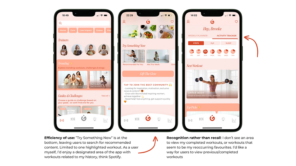


Heuristic Evaluation Slide Deck Gallery
JOBS TO BE DONE
This section articulates the user needs and motivations. I use a pyramid visual to emphasize the hierarchy of these jobs, showcasing the primary and secondary tasks.
Primary Job to be Done:
I want to know which workouts are accessible to users so they could be completed anywhere.
To achieve this, I focused on creating a user-friendly interface that highlights workouts based on accessibility, ensuring users can engage in exercises regardless of their location.
Secondary Jobs to be Done:
I want to see my completed workouts to decipher which workouts have been completed.
To address this, I designed a feature that allows users to track and review their completed workouts easily. This provides a clear overview of their fitness journey and accomplishments.
I want to quickly understand which workout is next based on my unique fitness journey.
In response to this need, I implemented a personalized recommendation system. By analyzing the user's fitness journey, preferences, and progress, the platform suggests the next suitable workout to keep them on track.
Universal Considerations:
Understanding that everyone has preferences, fits all user types (trainers, fitness goals, abilities, locations, equipment)
I want to be guided when choosing my own workouts within my constraints.
To cater to diverse user needs, I incorporated a guided workout selection feature. This ensures that users can choose workouts tailored to their preferences, fitness goals, abilities, locations, and available equipment.
This pyramid visual emphasizes the primary job at the top, supported by the two secondary tasks. The foundation represents the universal considerations that cater to a wide range of users. Each level of the pyramid builds upon the previous one, creating a clear hierarchy of user needs in the "Jobs to be Done" section.

THE CONCEPT
Designing for lifestyles
.png)
Readjusted hierarchy
-
Users are introduced to recommended content based off their history and preferences when they enter the workouts landing page
See completed workouts
-
Faded WeGLOW logo over workouts and guides informs the user of content they have previously completed
-
Users can repeat those they enjoyed, or know when it's time to try something new
Friction free switching between home and gym-based workouts
-
Prioritized at top of page
-
Highlighted category communicates to user which content they are viewing
-
Consistent throughout website, easy switching when needed
Increased filter and sorting accessibility
-
Consistent communication between filters at top and bottom to illustrate to user how many and which filters they've added
-
Increased access to filters personalizes browsing experience
- Filters accessible at top and bottom of page, sorting at bottom
- Number of filters added included on bottom filter bar
Content Categorzied
-
Guides and Workouts are separated for easy navigation
-
New content at top in respective category
Increased communication with user
-
Download and Heart icons included for users to quickly save workouts or guides for future use
-
Equipment expectations explained under "Home" filter and included visually beside guides and workouts
.png)
02
My Process and Redesign
In the initial project phase, I navigated through interviews, assumptions, current flow analysis, competitive assessments, and brainstorming sessions. Recognizing the time constraint, I gathered insights from close circles, unveiling a unanimous sentiment that WeGLOW's workout browsing experience was cumbersome. Crafting a persona spotlighting busy young professionals, I pinpointed their needs for efficient home-based workouts and familiarity with app navigation.
56.1% of surveyees workout at home post Covid-19 outbreak.*


Transitioning from problem identification to solution exploration, I analyzed the competitive fitness app landscape. Drawing inspiration, I asked a pivotal question: "How Might We make users feel more supported in choosing workouts within their constraints?"
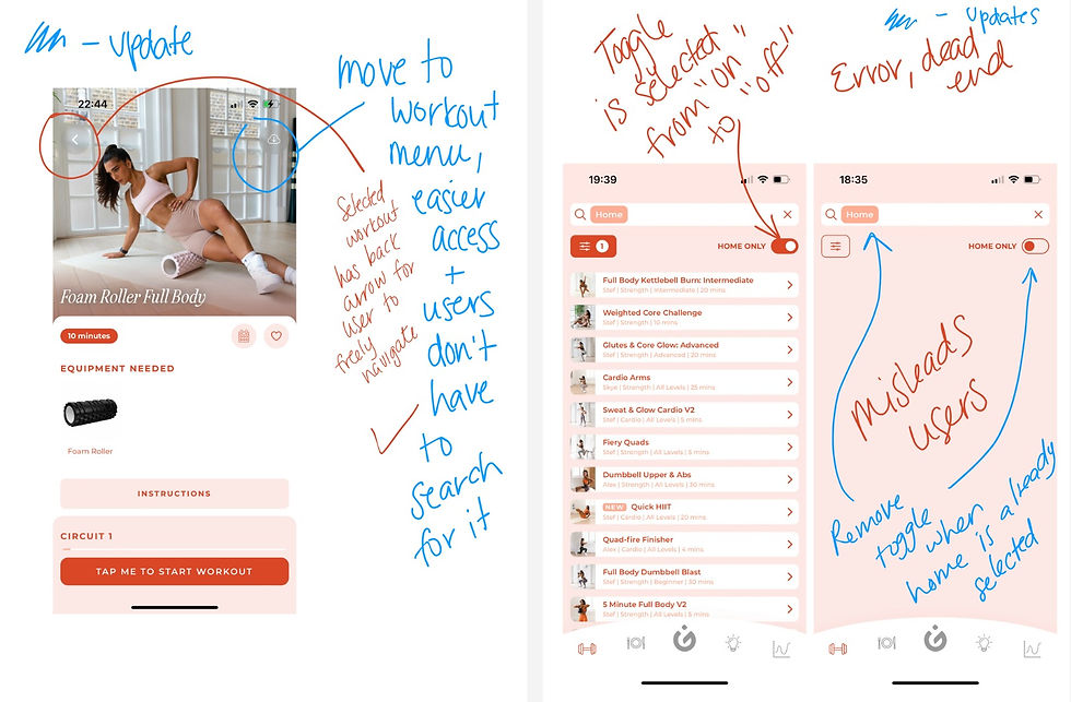
This inquiry guided a thorough app evaluation, leading to wireframing solutions that streamlined navigation, prioritized personalized content, and enhanced the overall WeGLOW experience. Notable improvements included a quick switch between gym and home-based workouts, a translucent WeGLOW logo for workout tracking, and a revamped browsing page with a bottom filter for user-centric adaptability.
These refinements were geared towards creating a seamless and supportive environment for busy young professionals navigating their fitness journey on WeGLOW.
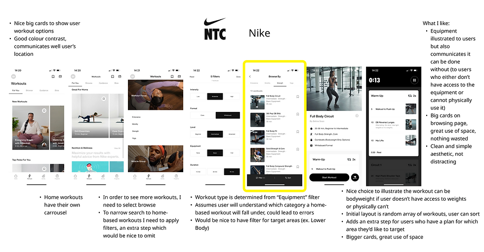
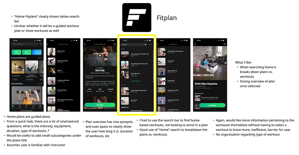
Competitive Analysis Slide Deck Gallery

Wireframes & Brainstorming Slide Deck Gallery


Redesign Slide Deck Gallery

Describe your image


Describe your image
CONCLUSION
03
Research Plan & where do we go from here?
Reflecting on this project, despite time constraints, the excitement to push WeGLOW to its full potential is palpable. The key lesson learned is the delicate balance between time limits and robust, research-backed decisions. Nielsen's Severity Ratings guided prioritization amid assumptions. Envisioning the project beyond its current scope involves intensive user interviews, A/B testing, and implementing new standards for enhanced accessibility.
In conclusion, this challenging yet enlightening journey emphasizes the balance between time constraints and data-backed decisions. Nielsen's Severity Ratings proved invaluable. Looking ahead, dedicating more time to refine WeGLOW is the goal, incorporating user interviews and A/B testing for an evolved, seamless user experience. The commitment to growth and refinement remains unwavering.
.png)